Ariel -
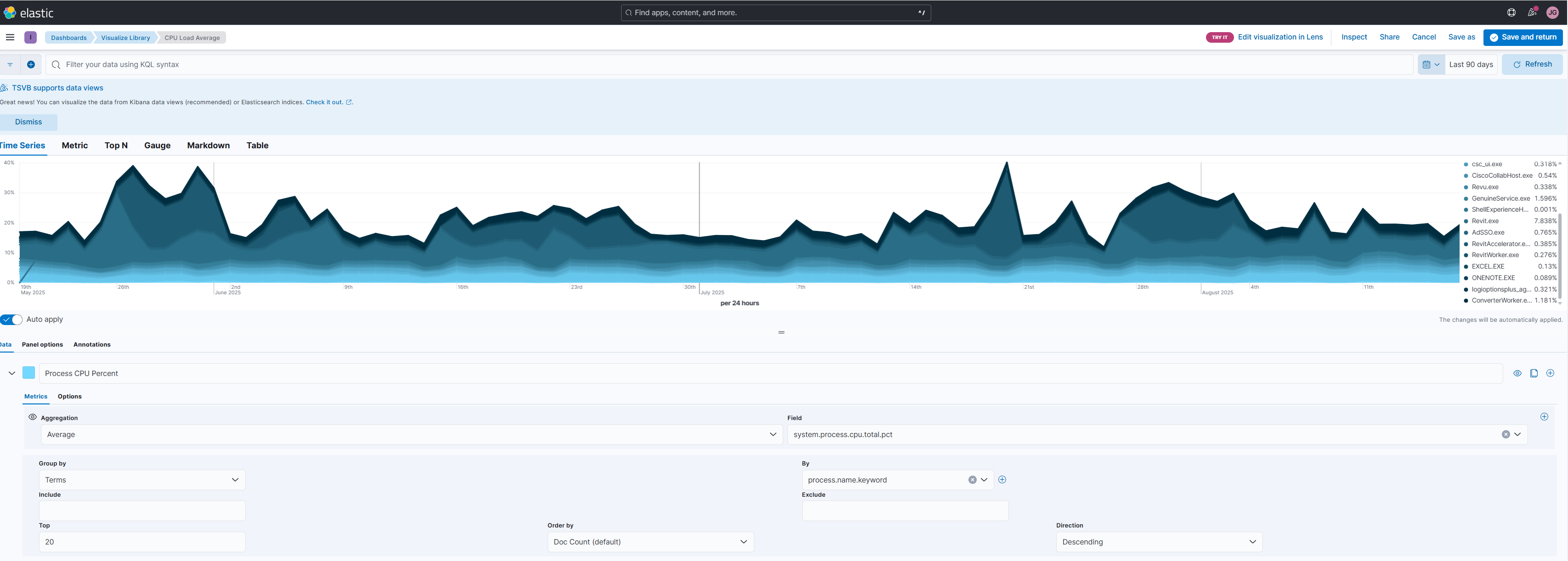
The Visual in the snip is one of the original views we had in the base package when we started using Bimbeats. I would like to see if this can get re-created in the current version of elastic. What I like about this visual - it is showing me what processes are using the most CPU’s, I get that information by seeing the size of the color. I also like the time span - this has helped us narrow down when something started using more of the CPUs.
Do you have any good ways to show this not using the TSVB visual?
We can re-build this in Lens by using the same fields within the Lens interface.
Here’s a quick shortcut for this:
When editing the TSVB visualization, you might see the following button on the top right:
Clicking on it will recreate the visualization as-is using Lens.
Something to note about the above the visualization, it graphs system.process.cpu.total.pct on the y-axis. This value comes from individual documents created for each process, which excludes certain processes (such as Chrome).
For a picture of a computer’s total CPU load pct across all processes, use the field system.cput.total.norm.pct which is collected when field event.dataset : “system.cpu”